Research:
We explored a range of official movie posters to get to understand the typical structure of posters and to gain an insight of some ideas for developing our own poster. We chose to research posters of films under the disaster movie and action genres as this would cover the broad range that our own post-apocalyptic hybrid film fit under.


The main inspiration of the Rise of the Planet of the Apes posters were in terms of layout and presentation as supposed to content. The poster on the left follows the foreground and background structure that we liked. Having the protagonist as a half-face shot allows for most of the focus with a little action or insight into the film in the background allows for interest with simplicity. As I also had the idea of replacing the human eye with a code or symbol to represent how humans are being coded; using this half-face shot would allow this to stand out further. The font on the title is simple, bold and clear.


Both of these posters cleverly incorporate their films ideas into the main characters. We had a similar idea to Tinker Tailor Soldier Spy, using code to make up parts of the face as like this spy film the codes connote what The Founder is creating of our characters. The way the text is structured in this poster is quite clear, it must be from a series of posters as this one does not actually show the official title. There isn't much being revealed apart from the stars and the genre, it also shows that the actors are the main selling point of the film. The tagline has been placed within the code and links the idea of the film together by being placed within the characters face.
The second is actually a Spanish DVD cover, but the idea of the DNA strand linking the characters faces together appealed to us, giving us ideas of possibly link The Founder and Lucas' faces together as shown in our planning.
The second is actually a Spanish DVD cover, but the idea of the DNA strand linking the characters faces together appealed to us, giving us ideas of possibly link The Founder and Lucas' faces together as shown in our planning.


In the Chrysalis poster there is a clear use of layers to build depth in the poster. The center of the background shows the silhouette of a male and female trapped, perhaps a couple, this establishes the characters being in danger. The green clouded sky hints an evil power taking over and the use of shadows in the foreground connote the idea of an unknown evil. The the bodies reaching out for the characters suggest that they are taking over. The title and writing compliment the 'evil' in green and the font reflects a scrawl like someone has scratched their name into a tree or a wooden door; this makes you think of characters when they are afraid and trapped in a room like in so many horror films. Similarly to the first poster, World War Z does not show any main characters as the face of its poster, we can recognise the main actor, Brad Pitt without having to see him. The foreground of this huge pile of bodies leading up to a helicopter being weighed down shows the mass number involved and is common in a disaster film poster. A lot of disaster film posters tend to show an iconic or vast landscape and a small character or focus image to show how the world is defeating what little is left, as shown in the I am Legend poster.


Both the Wolverine and the Avengers posters are very simple but very impactful in terms of their message. This works mainly because these are iconic superhero figures. The Avengers poster will be one of a series due to our knowledge of there being other main characters other than Captain America. The mise-en-scene showcased in the background of both posters creates a chaotic and dark atmosphere, giving us a sense of what to expect in the film. The characters dominate the foreground despite the darkness portraying them as being quite powerful and strong. Both characters are armed, one with a shield, suggesting his role as being a sort of soldier or protector and then Wolverine as a fighter with his open body language, angry facial expression and metal claws.


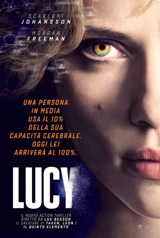
The poster for Lucy and Altered Perception are both focused on a specific section of the characters face, especially the eye. As the eye became the focus of these poster it made what was different about them, stand out a lot. It also helped to give away ideas about the narrative and what may be significant through out the film. We liked the poster for Altered Perception as the use of a needle with the formula is very similar to ours and we thought it made an effect as it is very uncomfortable yet intriguing to look at. The poster of The Road helps to show the setting for where the film may take place. The fact that the characters are facing away from the camera helps to add mystery to that the film may be about as we do not know anything about the characters. The character on the right is shown as more weak and vulnerable as the character had their arm around them. The dark colours on the poster help to show the darkness of the film and the gloomy and sinister atmosphere. As the character on the is left is holding a weapon in their hands shows that they may face some sort of danger in their film which they may need to protect themselves from.
planning


These were our initial ideas for the poster we were going to make We thought that the last one was our favourite and that was the one we went with because it captured the essence of our film but also looked professional. The other ones we thought could have worked, but we didn't like them because they did;t really capture what we were trying to create. For example, the young boy and older boy one would have cleared up our storyline, but it would not have related to our film at all. The one with the founder and Lucas' face almost merged together was a good idea, because it could create the enigma "who are you" suggesting that there is more than what meets the eye with the antagonist and protagonist.
Editing process
|
|
This is the planning process behind the creation of our poster . Originally, we had just merged two images together to create the background, and all we needed to do was to create the finishing touches with the eye and the sky and filter, in order to create a gloomy and dull tone.
FINAL PRODUCT

